Here is a step by step of my regular process to start a character. This method is working for props and landscape designs as well. Mostly useful to create quickly iterations of designs, colours palettes and lighting, before getting too far into details. More details and explanation of each step below the video:

#1

The first step is the easy one for those who like sketching: in photoshop I usually separate the steps I'm happy with in different layers, to be able to come back on a previous version quickly.
Once you start sketching the face of the character, I realize that it can slow you down in the exploration, as the portrait is crucial to give personality to your character. So if you're starting this part too early, you might feel that the body should follow the current personality. However, if you keep that 'portrait' step for later, you might have more freedom to create different gestures and body types.
#2
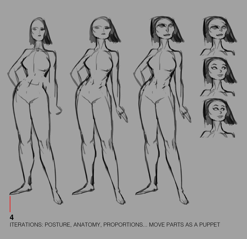
This part is mostly about transforming the base, doing iterations of portrait or body parts (somehow like puppets), proportions, and fixing some anatomy details.
From the same face, I was exploring different kinds of proportion (sometimes weird), looking for realistic and cartoony possibilities; so that the character attitude can change a lot.
#3

When I'm happy with the anatomy style and the 'attitude' of my character, I start the lighting (or the colours, as flat areas,... the order is not really important at this stage since it is a fast process).
I could also propose iterations of lighting, to explore moods; but here I was convinced by the strong backlight, somehow dramatic.
Then it is up to you about how you're gonna treat the lighting on the character: flat? Gradient? Smudge tool? Textured brushes?... (pictures ?). It depends also on what final rendering look you'd like to achieve, that might help you to keep that in mind (realistic, cartoony...).
Here I often add a sort of glow/soft light to smooth the line between shadows and lighted areas; but not everywhere: I try to find the good balance, to keep the look dynamic.
#4

After the slight glow step, I define the body parts in depth and I exaggerate the idea of distance between them (= imagine it was a landscape, filled of hills and mountains:
- the neck is farther than the chin (or the face),
- the back hair is definitely in the back as well,
- the arms start somehow behind the front chest,
- the left leg is in the back, according to the perspective.
= after selecting these 'far' areas, I light them up (usually gradient, on a new layer as clipping mask).
Finally, I start choosing colours, applied as flat selected areas (new layers again) ; and I play with layer modes to find the good contrast, value, saturation...
At this point the psd file might look messy so I name layers and I group them.
#5 (last part)

As the first colours application is kind of cold, I will warm this up: thanks to the "glow effect" again. It is simply a circular gradient: yellow, or orange, or pink... I adjust it until it fits well with the colour or the material underneath.
I've not mentioned the bouncing light yet: this is a lighting rule that probably works everywhere (in any case I use it all the time!). The light starting from a source, is literally bouncing everywhere, from one surface to another, and it can go on far.
The light temperature obviously affects the reached surfaces, but will also transport the colour of one surface to another. That aspect will give much more richness to your colours palette.
That can be tricky sometimes to try dealing with realistic conditions, analyzing or anticipating how colours will merge together, but you don't have to strictly play by the rules, have fun ! 🦄
I usually follow those thoughts to avoid technical headaches (in a complicated illustration):
- the dominant (and the most powerful) light will mainly affect the reached areas (= higher contrast and saturation on those areas, and it'll be lower as the light is bouncing far).
- It will always have a warm or a cold temperature (never neutral because it won't amplify the colours palette).
- I will also define one dominant colour, and several secondaries, less powerful.
- above all, I will trust and follow my tastes and 'my vision' of colours. That perception is totally subjective and personal, so that anyone can develop his own sens of lighting and colours. That means also : you can break the rules 🎉
Eventually after this lighting and colours exploration + a few iterations, it may be the time to take on the details work (facial features here).
